


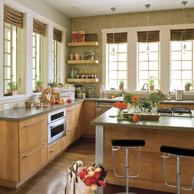
 This kitchen from Southern Living turned up both in my inbox and on the Gardenweb! Everyone agreed the windows were wonderful. This kitchen won high marks because of its size, it is so large the storage aspect would not be compromised.
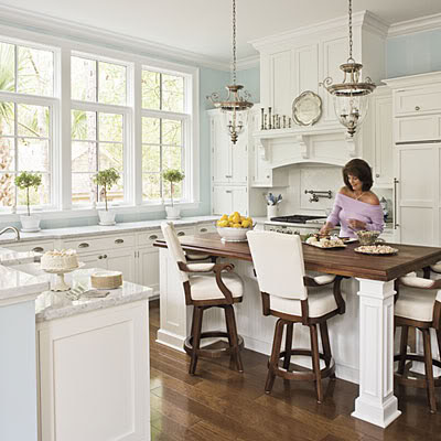 Another kitchen from Southern Living with a similar feel, though this kitchen had a mix of windowed walls and storage walls. Having both seems to be a popular trade off.
 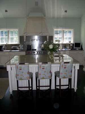 Linda Banks of Banks Design (one of my favorite designers) contacted me. She mentioned she wrote an article over 15 years ago in the now defunct, Decorating and Remodeling Magazine, shunning upper cabinets. She continues to limit their use in her kitchen designs. Here is a beautiful kitchen she did in CT.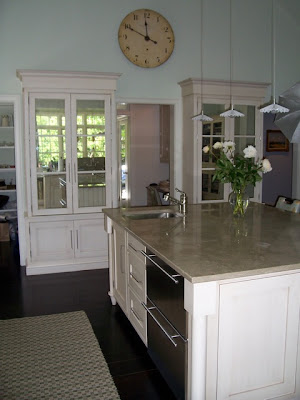

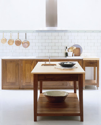 Many of these kitchens highlighted different types of storage - Here we see a copper pot rack on the wall. This could easily free up a lower cabinet for dishes. This kitchen is from Plain English.
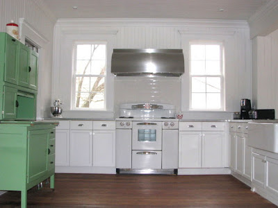 Many readers also mentioned that omitting the upper cabinets is easier when other types of storage are available. This kitchen from HGTV shows a Hoosier cupboard.
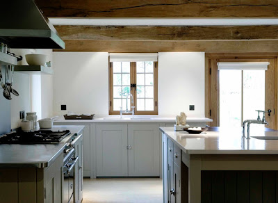 Photos of European kitchens came my way - here is another one from Plain English. This is a favorite of mine, I love simplicity and warmth in this kitchen.
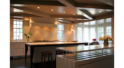 Another blogger directed me to architect Ruard Veltman who often sans upper cabinets. Isn't this kitchen fabulous?!
  Here is another angle of this great room! Notice the wonderful inset shelves on the left.
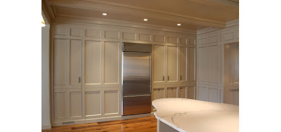 Most readers agreed that having a Butler's Pantry or large wall of cabinetry allowed the rest of the kitchen to be freed up to allow for windows. Veltman outdid himself with this striking wall of cabinetry.
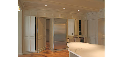 This wonderful paneled wall turns into a trove of hidden cabinets. Spectacular! To see more of Veltman's work here. To see more on Butler's Pantries click here.




 Apartment Therapy
I am always so impressed the way designers and architects find small niches for home offices. In my own home , we have a dedicated office space, but my husband often works from home and so it is "his"office. That left me trying to carve out a niche for myself in some other area of the house.
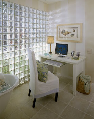 Brian Vanden Brink
 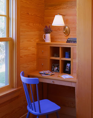 Hutker Architects
Have a small area in your hallway? Here is wonderful little space that has been efficiently utilized.
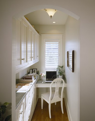 Domenic Mercadante
Here is an office created in the far part of a butler's pantry. Spaces doing double duty!
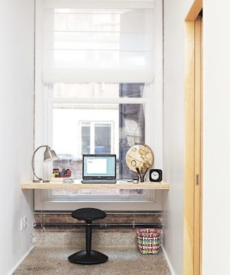 Apartment Therapy
 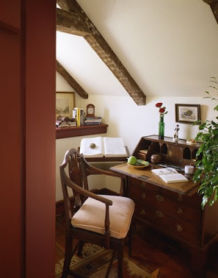 Centerbrook Architects
An attic alcove has just enough space for a small desk and chair.
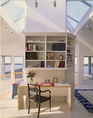 Anthony DiGregario Architects
Here is an unusual space at the top of a landing. The owner added built ins for a very efficient space -notice how they wrap around to the right.
.
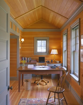 Tittman Architects
This area is not quite as small as some of the others but I included it because it is a space used by two people or one that does double duty. Notice the desk behind the table. Perhaps a shared space or the table is used for crafting.
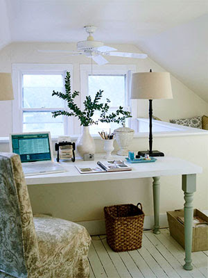
Better Homes and Gardens
Another small area at the top of a landing or part of a small bonus/loft room.
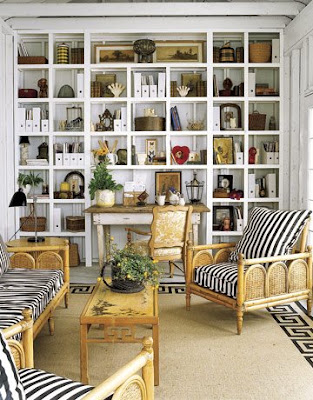
Country Living
Although this office area is not in a small room; it is in a small space. Interestingly the desk is tucked into the bookcase design, taking very little space up in the room. Very creative!
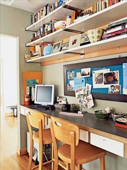
Restyled Home
Here is a desk area tucked into a pass thru hallway. I like the vertical use of space in this area. The two chairs are also very functional for a parent to sit and help with homework.
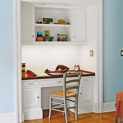
This Old House
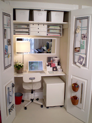
Of course a well designed closet space can be turned into a wonderful office. Take off the doors and viola - home office!
 Steve & Chris
Or leave the doors on and close them if things get too messy. I really like the bulletin and peg boards on the doors for storage and notes.
 Apartment Therapy
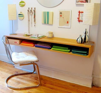
This is a wonderful modern example of how any space can be turned into an office.
Let me know how you have used an unusual area in your home as an office!
When I bought my house I felt the kitchen needed some minor renovation. Here's what I liked: the layout and the windows across the entire back of the space,which gave it incredible light. I liked the white cabinets, and the recessed ceiling in the kitchen area. What I didn't like was the lack of a center island and the way the cabinets seemed cut the space in half. I disliked the backsplash, and the very badly scratched white Corian counters. I also disliked the lack of mouldings and details, that were so abundant in the other rooms of the house. These pictures were taken when the house was for sale and include the previous owners furniture and accessories.

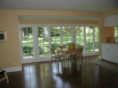
The area above is also the family room space, though they had taken out the couch and love seat. I felt like the table was too close to the family room. An area needed to be added for the table to have its own space. During this renovation we designed and created a glass breakfast room for the table.
Here are some inspiration photos:
This is a Victoria Hagen kitchen. I loved the soapstone, subway tile and pendant lights. I also liked the beadboard ceiling, but perhaps a bit more scaled back.
 These two kitchens are from the Swedish Company, Kvanum Kok. I love the hardwood floors, soapstone counters and glass cabinets. I especially fell in love with the X cabinets.
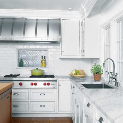
I loved this box out behind the stove for oils, peppermill, etc. I liked the different tiles with the white subway tile. But I preferred Calcutta marble in a herringbone pattern like this one below:
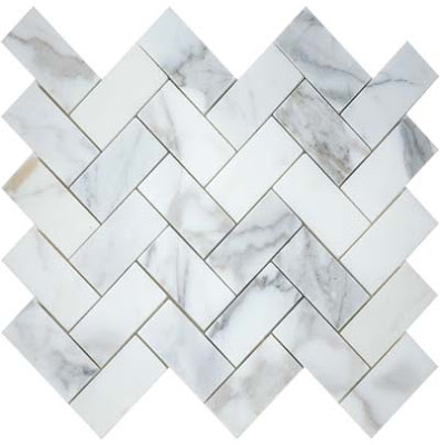
Here's my inspiration:
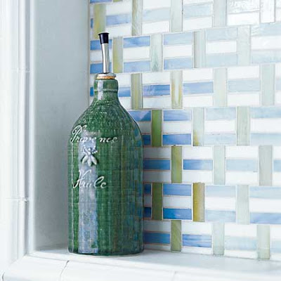 Here is my box out behind my stove:
 Here is the full view. I also added a marble shelf. It is a small feature but it adds so much!
  Here is the after:
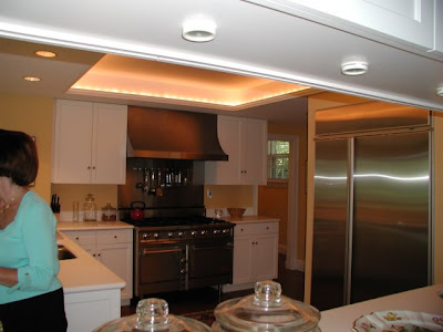
 Notice the plain ceilings in the before picture and the beadboard ceilings in the after. Also new sinks and faucets and moulding details. I also added ice box latches and bin pulls to the cabinets.
 Here is a great picture of the windows which have been raised up about 4 inches so the door and window moldings align.
 And after:
 New gas fireplace and mantle. Notice the detail work; the moldings wrap the entire room and match the living room moldings which are original to the house.
 Here is another view which peeks into the living room and dining room. (The clock is an art piece by a local artist who uses salvage materials to create new objects)
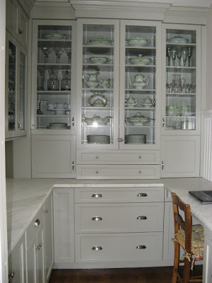
  Finally the kitchen looking toward the Butler's pantry. I think the gray walls of the kitchen with a touch of marble and beadboard ceiling, ties in nicely with the gray cabinets, marble and beadboard in the pantry.


